If you want to make your data more credible, there are some simple steps you can follow:
- Add Error Bars: Include error bars in your graphs or figures. This shows the uncertainty of your data and provides additional information to enhance the credibility of your data.
- Format the Borders of Your Tables: When creating tables, you can use only horizontal lines for the table borders. This makes them clearer and easier to read.
If you’re using Microsoft Word, there are preset layouts in the “Table Design” tab. You can further customize and adjust them as needed, but starting with templates is also an option.

3. Use Sans Serif for Your Figures: When creating graphs or figures, it’s better to use sans-serif fonts like Arial or Helvetica. Sans-serif fonts have no extra lines, making them easier to read and look more professional.
4. Convert 3D Figures to 2D Figures: If possible, convert 3D figures to 2D figures. Data is displayed more neatly in 2D, making it easier to understand in your research. Just like tables, it’s easy to convert them using Microsoft Word or Excel.
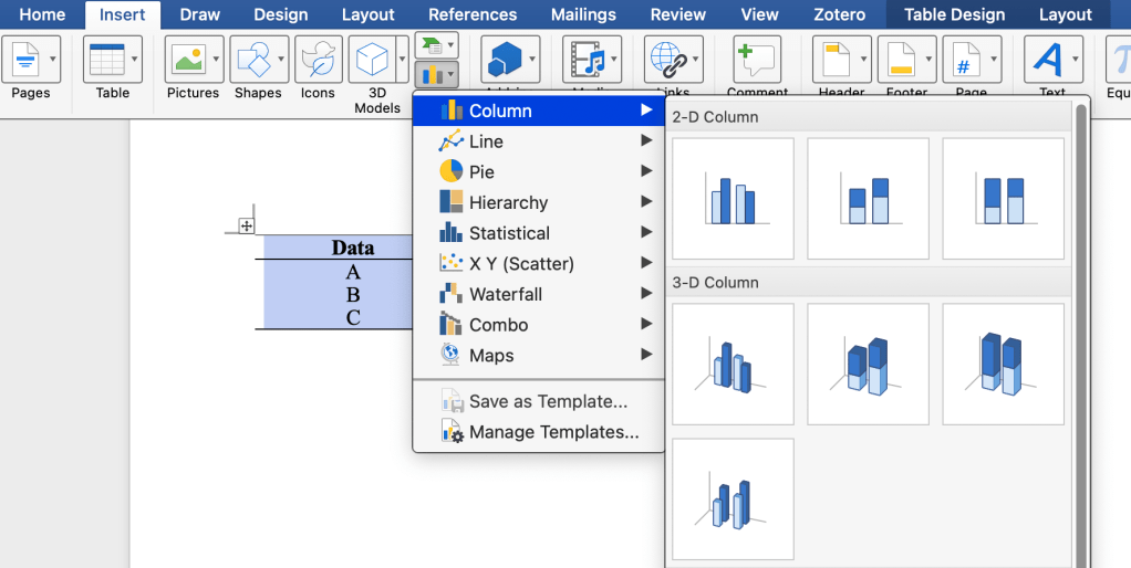
If you already have a chart, you can visit the chart design and click “change chart type” to adjust it accordingly.

REMEMBER:
- Add error bars to your charts.
- Format table borders with only horizontal lines.
- Choose sans-serif fonts like Arial or Helvetica for your figures.
- If possible, convert 3D figures to 2D for better reader comprehension.
