Most likely, your results will come from figures and tables while the discussions will come from the text. Simply put, you can’t have results and discussion without your figures and tables. If you’re confused how to display your data, simply remember that usually the graphs needed would fall on either two categories: If you need to show numerical results, use a table. On the other hand, if you need to show the trend in data, use a scatter plot. There’s usually no need to worry about the other types of charts!
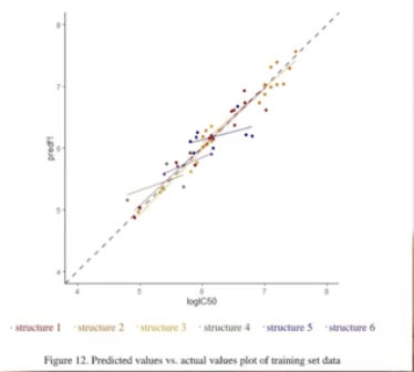
In this figure above from one of Le’s student groups, the researchers wanted to show datapoint that do not follow the trend, and hence they used the scatter plot.
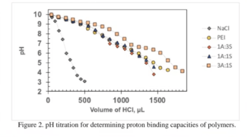
In another study, Le’s students wanted to show the trend of the titration curves especially since the curves on the right give more information compared to that on the left. There’s other quantitative data that can be applied on the scatter plot- but because there’s already too much information, they decided to put the remaining information on a table instead.

Remember
Always put your figures and tables first! You cannot have a good discussion without them.
If you want to show numerical results, use a table; if you want to show trends, use a scatter plot.
In the case that your data might have too much going on, you can use both scatter plots and tables to keep your data organized.
