Many types of shoes can be found in Marikina Shoe Museum. We can study the chemical content in these shoes and see whether these are safe when the use of these chemicals is not controlled. There’s one study on a shoes factor in Pakistan, where they compared the chemical content in the blood samples of factory workers compared to that of ordinary people.
In the bar graph seen in the video, we can compare the average blood sugar or glucose levels between that of the factory workers with that of ordinary people. From this, we can see that the average glucose level of the factory workers is slightly higher than that of the ordinary people.
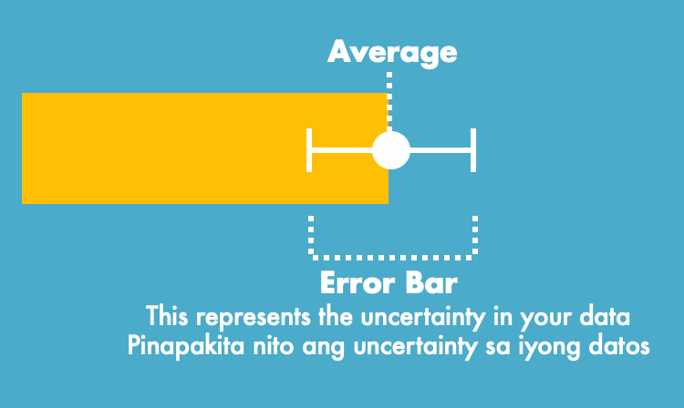
However, you might notice something that is sticking out of the bar graph. What do the thin lines represent? These are error bars and these show the uncertainty of the data. There is a possibility that the true value of blood sugar is not the average, but can be seen within the range of the error bars. This means that even if the average is slightly higher, if the error bars overlap, there could be a possibility that the two values are equal to each other. In other words, we cannot say from this graph that the blood sugar levels of the factory workers is higher than that of the ordinary people.
REMEMBER:
Error bars are thin lines in graphs that show the uncertainty of the data.
The true value of your sample may not necessarily be the average, but could fall within the range of the error bar.
It is important not to make conclusions based only on the averages especially if the error bars are similar.
